
BACKGROUND & CHALLENGE
\\\\\Change can be hard; we get it.
Background - Established in 1975, Bay Village was founded by Dr. Arnold Poole, a local pastor at the Pine Shores Presbyterian Church. An astute and compassionate leader, he developed relationships with many of its members, inspiring him to create a community for seniors, preventing them from having to move away. From this vision, Bay Village was formed.
Challenge - Bay Village has always done very well as a community. The previous management seemed to have the mentality of "if it's not broke, don't fix it" so for many many years Bay Village stayed basically the course and moved simply with the times. Under the new director, it was quickly realized that they needed to change drastically if they wanted to compete in their market. Over the last 5+ years they recognized an in-flow of competitors in the market and the pressing need to "upgrade" or be left behind. This is where we come in.
\ OLD LOGO
STRATEGY
\\\\\Is the building pink?
Bay Village embarked on a major renovation and expansion project to update almost the entire inside of their main building. We worked with Bay Village on a full rebrand that would dovetail with all their renovations. They also took this opportunity to add quite a few amenities and services for the residents.
The overall strategy was to absorb all of the new, update their existing brand and offering while keeping the integrity of who they are and have been. Did we mention that the building is pink? We were informed that it's actually shrimp color and not an option to change in the near future. We stuck our toes in the sand and got to work.
CREATIVE & EXECUTION
\\\\\Live Abundantly
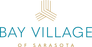
One of the other long recognized features of the campus is the height and shape of the main building. The building shape was part of their current brand and logo so an exploration began to see if we serve the current while creating with the new. The new brand was established. The logo complements the new vision and mission of Bay Village perfectly.
The other major theme that appeared from the research was that even though their campus was smaller in comparison to their competitors, there was still an abundance of services and amenities. This led to the idea to Live Abundantly at Bay Village. It's not just about service and amenities either. It's about the environment itself. It's about relationships. It's about quality of life. It's about the ability to choose how you want to live.
\ NEW LOGO
 /\\\\\
\ CORPORATE IDENTITY
After establishing the new brand it was time to get creative on all the new materials that Bay Village will need. The design and aesthetic is a continued evolution taking cues from the new renovations.

\ BROCHURE DESIGN
One of the materials included in the campaign is this brochure. It had to feel sophisticated and polished without being pretentious or snobby. It features all new photography and space. Similar to the renovations, it had to be bold, bright, but room to breathe, on purpose.
All of the other pieces encapsulate this theme. The designs are simplistic without being simple. They really show that Bay Village is raising the bar.


